How To Change Tradingview Candle Type & Color
Changing the color and type of candle on your Tradingview chart is easy, you just have to know where to look. You can figure it out easily by looking at the images in this post, or feel free to read along for a step by step guide on how to change both the candlestick color and type of candlestick. We will also cover how to get indicator candle coloring to show up instead of regular chart candle colors.
Video Tutorial: How To Change Candle Colors, Types & Use Indicator Candle Coloring

How To Change Candle Colors On Tradingview Charts
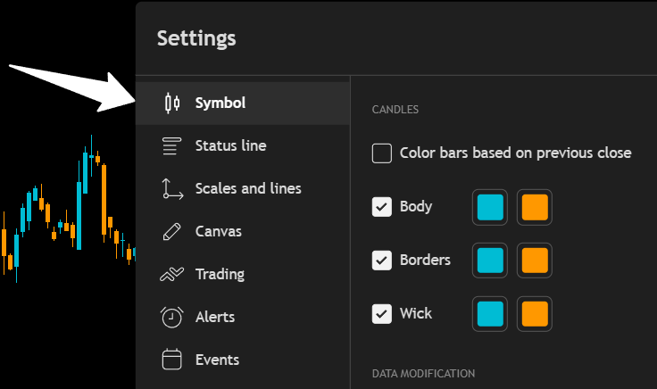
To change the colors for up and down candles(or any other type of candle) you need to open up the chart settings. This will be located in the top right corner of your chart and look like a nut icon as shown in the picture below.
Next, click on the Symbol tab on the left side of the settings panel as shown in the image below. There you will see color inputs for up and down candle’s Body, Border and Wick. The colors on the left side will be for up candles and the colors on the right side will be for down candles.
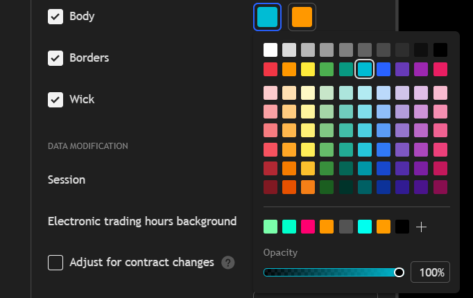
Click on the color you want to change and then either select from the panel of default colors, or you can click the plus button near the bottom and select a custom color using the color selector or typing in a color code.
If you select a custom color, you can click the add button and it will add that color to your favorites which will all show along the bottom so you can easily choose that color again for other candle parts.
At the very bottom of the color panel, there is a transparency slider. This allows you to set the colors to partial transparency, completely transparent or no transparency which is a solid color.
How To Get Indicator Candle Coloring To Appear
If you are using an indicator that colors the candles based on the indicator’s calculations, then you will need to turn off the candle coloring in the chart settings to get your indicator candle colors to appear correctly.
Do that by going into the settings panel, clicking the symbol tab and then turning off the toggles for body, borders and wick. You may want to leave borders or body on with a grey color so you can see the candle body when your indicator candle colors lag, but that is up to you.
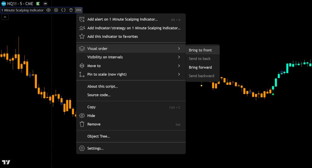
Lastly, hover your mouse over the indicator name that has custom candle coloring. Then click the 3 dots at the end, hover over Visual Order and then select Bring To Front as shown in the image below.
How To Change Candle Type On Tradingview Charts
Changing the type of candle on your Tradingview chart is very easy. Just click the button in the top middle of your chart that looks like 2 candlesticks side by side and a dropdown menu will appear with all of the different options you can choose from. The button you need to click is shown in the image below.
Click on the type of candle you want to use and your chart will update to those candles as long as they are compatible with the chart data you are viewing. For volume based candle types, make sure you are viewing a chart with volume data or the candles won’t work properly.
There are currently 6 different categories of candles available to choose from, each with 2-6 different types of candles in that category. Here is a list of the what candle types Tradinview offers:
Types Of Candles To Choose From
Candles
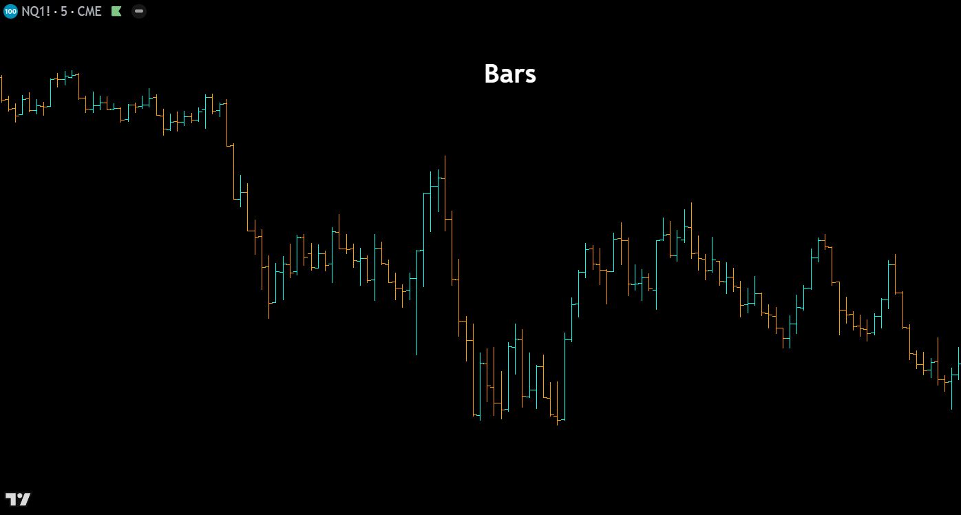
Bars – Bar charts display each period’s price action as a vertical line spanning the high to low, with small horizontal ticks marking the open (left) and close (right). This minimalist format reduces visual clutter compared to candlesticks, making it a favorite among seasoned traders who want clean price data without the distraction of filled candle bodies. Bars are particularly useful when analyzing dense charts with many periods on screen.
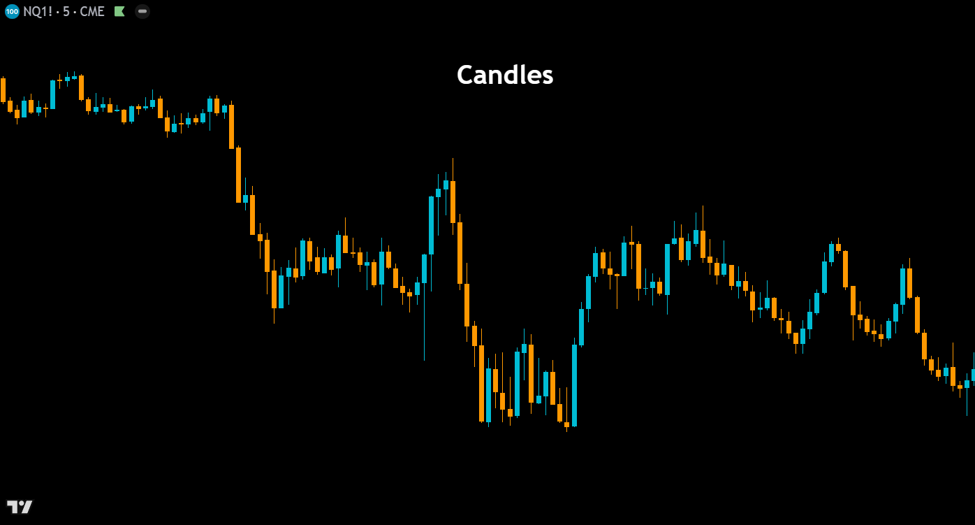
Candles – The most widely used chart type in technical analysis, Japanese candlesticks represent each period with a rectangular body showing the open-to-close range and thin wicks (shadows) extending to the high and low. Green (or hollow) candles indicate bullish closes, while red (or filled) candles indicate bearish closes. Candlestick charts form the foundation of pattern-based analysis, enabling traders to quickly identify formations like dojis, engulfing patterns, hammers, and shooting stars that signal potential reversals or continuations.
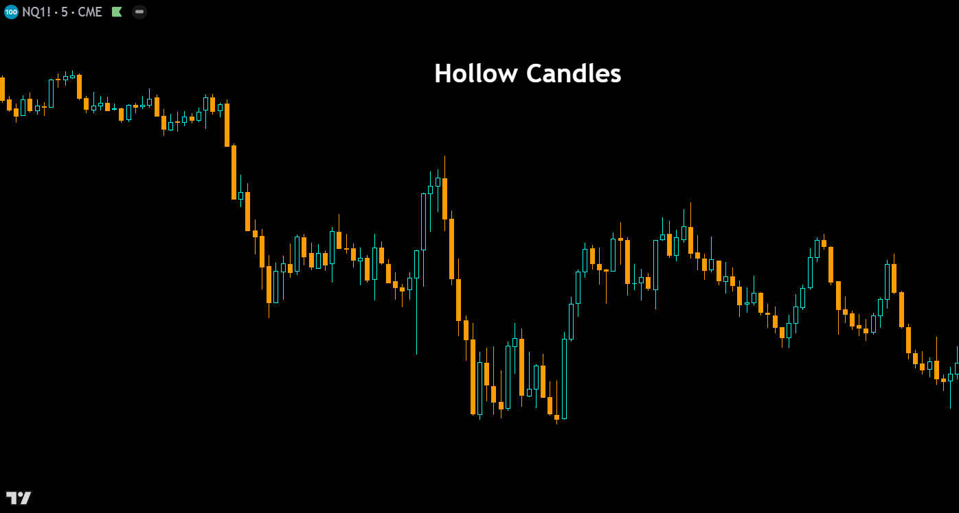
Hollow Candles – Hollow candles add an extra layer of information to traditional candlesticks by encoding both the open-to-close relationship and the close-to-previous-close relationship into a single candle. A hollow (unfilled) body indicates the close is above the open, while a filled body means the close is below the open. The color then reflects whether the current close is above or below the previous close. This dual-encoding system gives traders a faster read on both intrabar and interbar momentum at a glance.
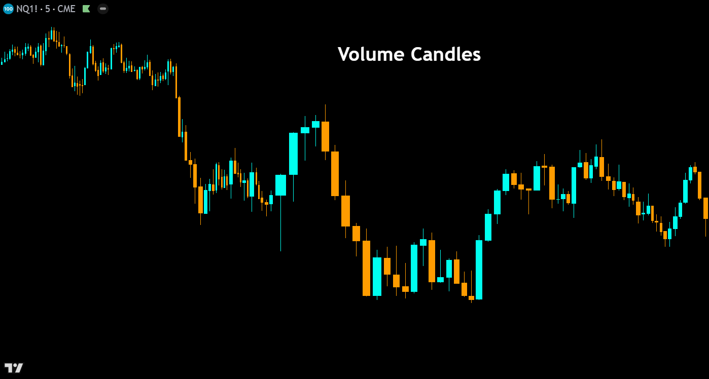
Volume Candles – Volume candles modify the width of each candlestick body based on the volume traded during that period. High-volume bars appear wider, while low-volume bars appear narrower, creating an intuitive visual link between price action and participation, similar to our order flow candles indicator. This chart type helps traders instantly identify which price moves were backed by conviction and which occurred on thin volume — a critical distinction when evaluating the strength of breakouts, reversals, and trend continuations.
Lines

Line – The line chart connects each period’s closing price with a continuous line, stripping away the open, high, and low data to present the cleanest possible view of price trajectory. This simplicity makes it ideal for identifying broad trends, support and resistance zones, and chart patterns without the noise of intrabar volatility. Many traders use line charts to get a “big picture” read on a market before switching to candlesticks for entry timing.
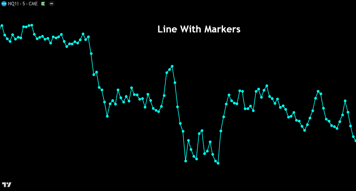
Line With Markers – This chart type functions identically to a standard line chart but adds small circular markers at each data point (closing price) along the line. The markers make it easier to identify the exact location of each period’s close, which is particularly helpful on higher timeframes or when zoomed out on a chart. It offers a subtle visual upgrade that helps traders pinpoint specific price levels without adding unnecessary complexity.
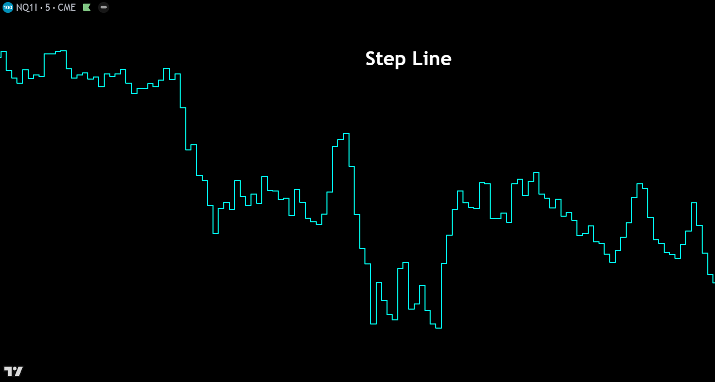
Step Line – The step line chart connects closing prices using horizontal and vertical segments rather than diagonal lines, creating a staircase-like appearance. Each price level is held flat until the next period’s close prints, at which point the line jumps vertically to the new level. This format clearly emphasizes the magnitude and timing of price changes, making it useful for identifying consolidation zones where price remains flat and breakout moments where price shifts sharply to a new level.
Areas


Area – The area chart is a line chart with the space between the closing price line and the zero axis filled with a shaded color. This visual fill makes it easy to perceive the overall magnitude and trend of price movement over time. Area charts are commonly used in market overview dashboards and when comparing the general trajectories of multiple instruments, though they sacrifice the granular open-high-low data that active traders typically need for decision-making.
HLC Area – The HLC (High-Low-Close) area chart displays a filled region between each period’s high and low prices, with the closing price drawn as a line through the shaded area. This creates a visual “band” of price range over time, giving traders an intuitive sense of volatility expansion and contraction alongside the closing price trend. It bridges the gap between the simplicity of a line chart and the detail of candlesticks, showing range without the complexity of individual candle bodies.
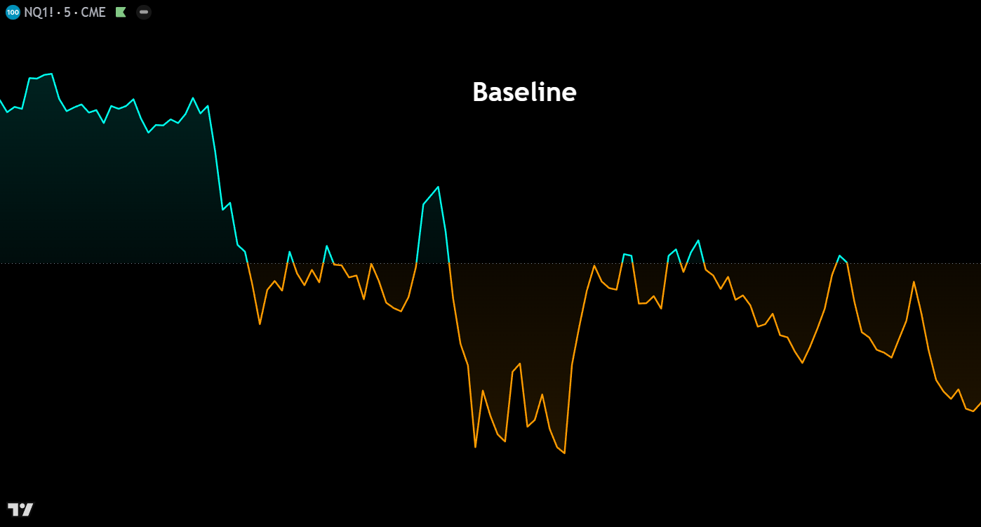
Baseline – The baseline chart plots closing prices as a line and fills the area between the price and a user-defined reference level (the baseline). Price above the baseline is shaded one color (typically green), while price below is shaded another (typically red). This format makes it immediately obvious when an instrument is trading above or below a key level — such as a moving average, VWAP, or a specific price — making it an excellent tool for mean-reversion strategies and relative performance analysis.
Columns
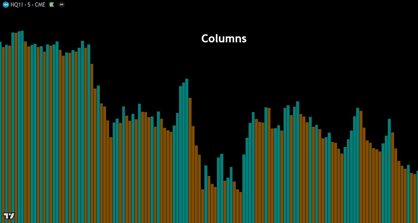

Columns – The columns chart displays each period’s closing price as a vertical bar extending from the zero line, colored based on whether the close was above or below the previous close. While not commonly used for direct price analysis on instruments trading far from zero, this chart type is highly effective for visualizing oscillators, volume data, and other indicators where the relationship to a zero or baseline level is the primary focus of analysis.
High-Low – The high-low chart renders each period as a vertical column spanning from the session’s high to its low, filled with color based on whether the period closed bullish or bearish. This format strips away the open and close levels within the bar, placing full emphasis on the total price range traded each period. It’s a useful chart type for quickly assessing volatility and the extent of price exploration, particularly when analyzing markets that experience wide intraday swings.
Custom Volume
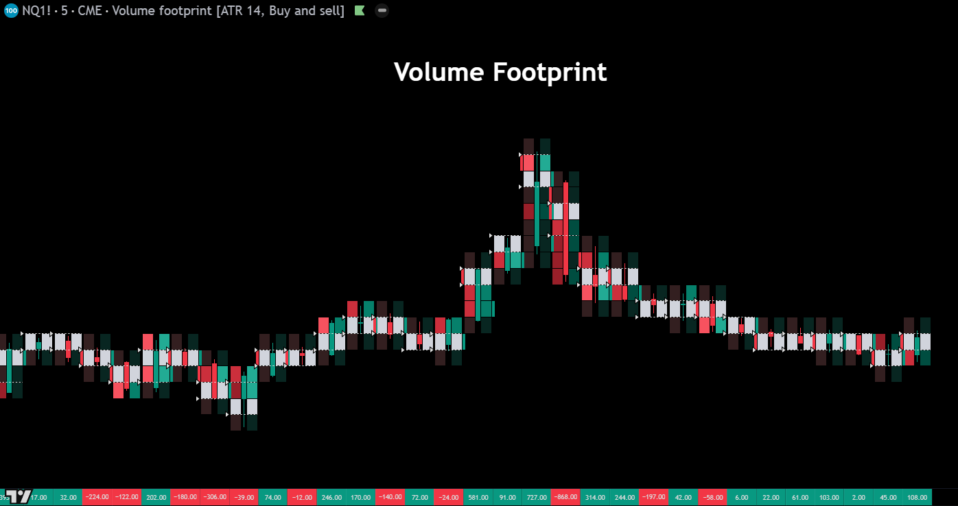
Volume Footprint – The volume footprint chart breaks down each candle into price levels and displays the volume traded at the bid and ask at each level within the bar. This granular view reveals the internal auction dynamics hidden inside a standard candlestick — showing where aggressive buyers and sellers were active, where imbalances occurred, and where volume was concentrated. Footprint charts are an essential tool for orderflow traders who need to understand the “why” behind price movement, not just the “what.”
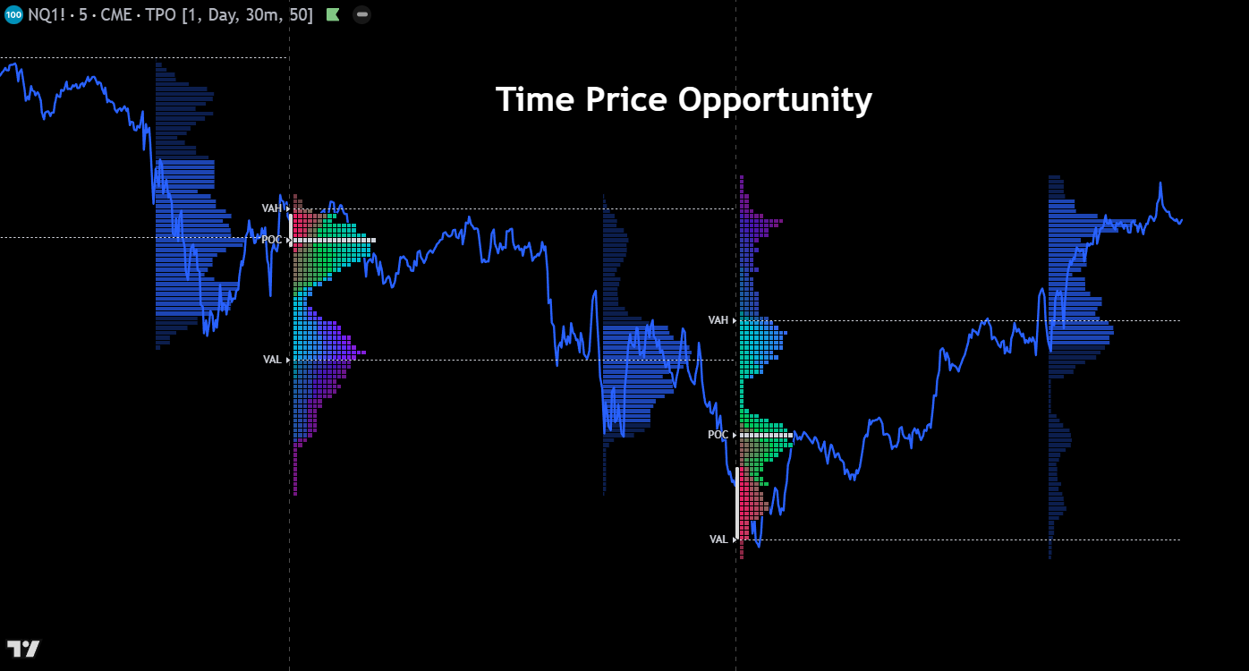
Time Price Opportunity (TPO) – Time Price Opportunity charts, also known as Market Profile, organize price data by the amount of time spent at each price level rather than by volume. Each time increment is represented by a letter or block, building horizontal rows that form a bell-curve distribution over a session. The resulting profile highlights the value area where the majority of trading time occurred, the point of control (most visited price), and the single prints that indicate fast directional moves — all critical concepts for auction-based market analysis.
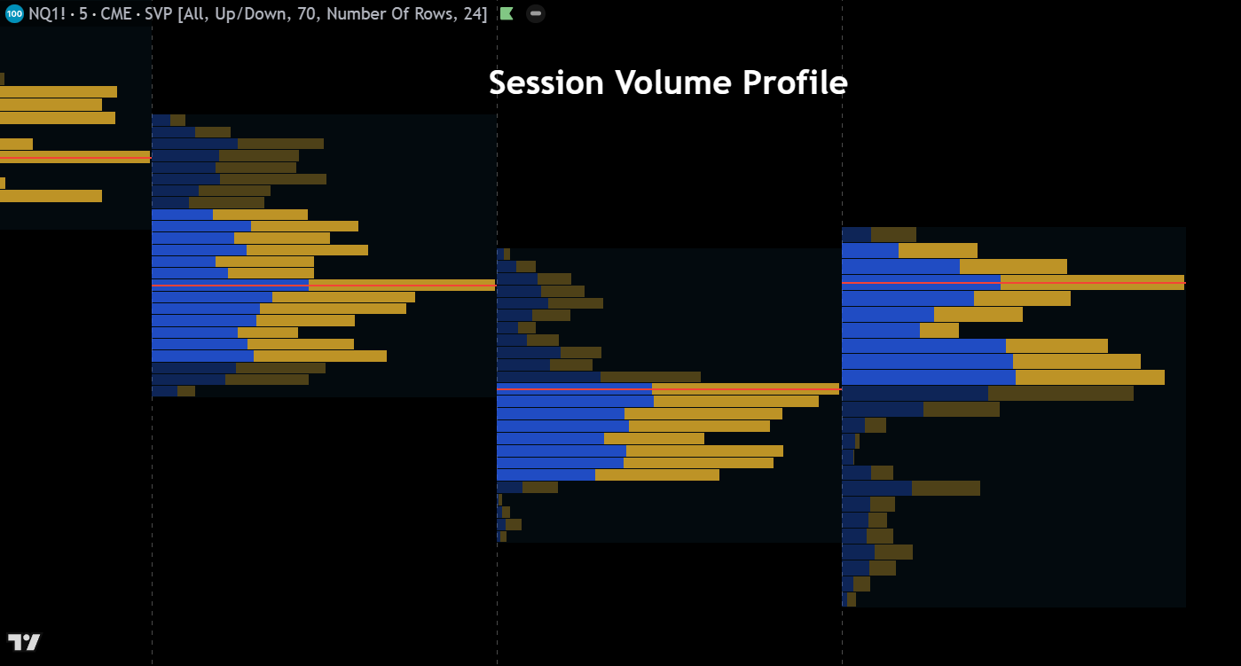
Session Volume Profile – The session volume profile overlays a horizontal histogram on each trading session, showing the volume traded at each price level throughout the day. This provides a visual map of where the most and least activity occurred within a session, clearly identifying the point of control, value area high, and value area low. Traders use session volume profiles to locate institutional accumulation and distribution zones, find high-probability support and resistance levels, and understand the context of current price relative to the day’s auction.
Miscellaneous
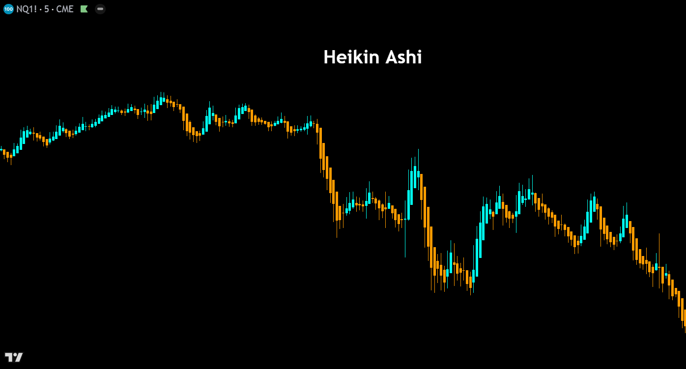

Heikin Ashi – Heikin Ashi candles use a modified formula that averages price data to smooth out noise and produce a cleaner visual representation of trend direction. Each candle’s open, high, low, and close values are recalculated using averages of current and prior bars, resulting in candles that more clearly show trending versus ranging conditions. While Heikin Ashi charts should never be used for precise entries or exits (since the displayed prices differ from actual market prices), they are excellent for identifying trend direction, momentum shifts, and periods of indecision.
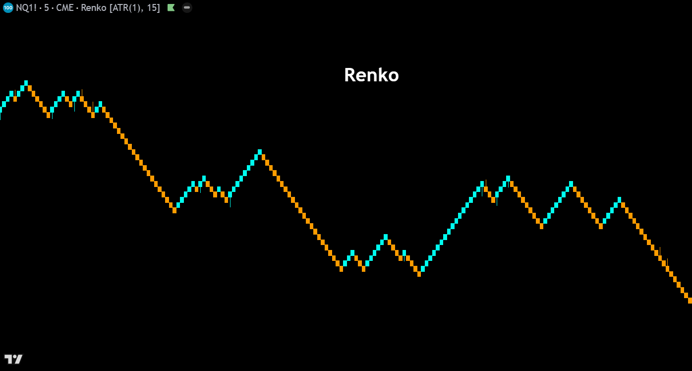
Renko – Renko charts are constructed entirely from price movement, ignoring time altogether. A new “brick” is added to the chart only when price moves a specified amount in one direction, creating uniform blocks that clearly highlight trends and filter out minor fluctuations. Bullish bricks print in one color, bearish in another, and reversals require price to move twice the brick size in the opposite direction. Renko charts are valued by swing traders for their ability to define clean trends, reduce noise, and generate straightforward support and resistance levels.
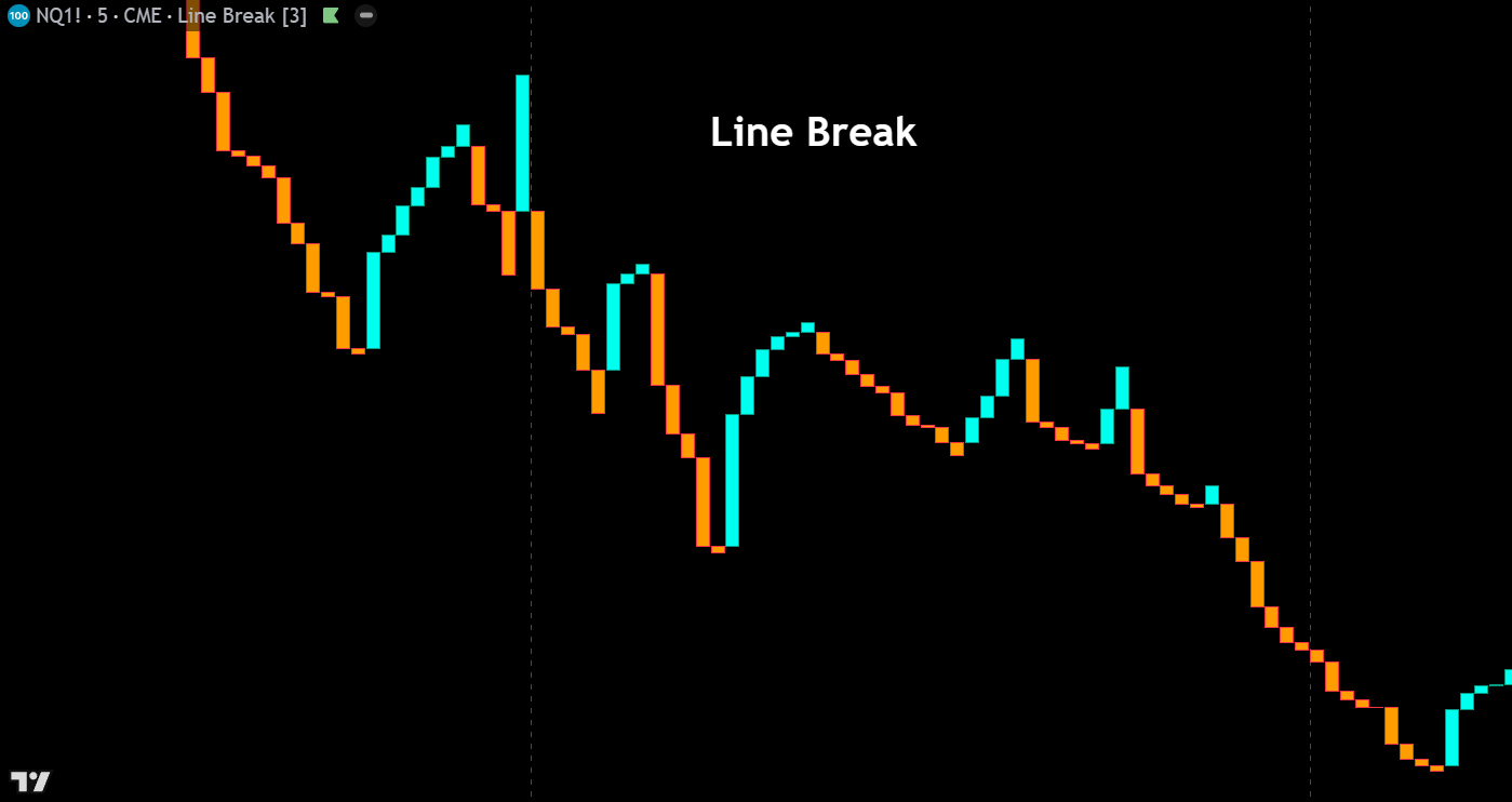
Line Break – Line break charts (also called three-line break charts) plot a series of vertical blocks based on closing prices, adding a new block only when the close exceeds the high or low of the previous N blocks (typically three). If price doesn’t break beyond these reference points, no new block is drawn. This creates a chart that naturally filters out minor price movements and only reacts to meaningful reversals, making it a powerful tool for identifying trend changes and eliminating whipsaws in choppy markets.
Kagi – Kagi charts use a series of vertical lines that change direction and thickness based on price movement, completely disregarding time. A line continues in its current direction until price reverses by a predefined amount, at which point a short horizontal connector is drawn and the vertical line shifts direction. Thick lines (yang) indicate price is above a prior swing high, while thin lines (yin) indicate price is below a prior swing low. Kagi charts excel at filtering insignificant price action and highlighting the underlying supply and demand dynamics of a market.
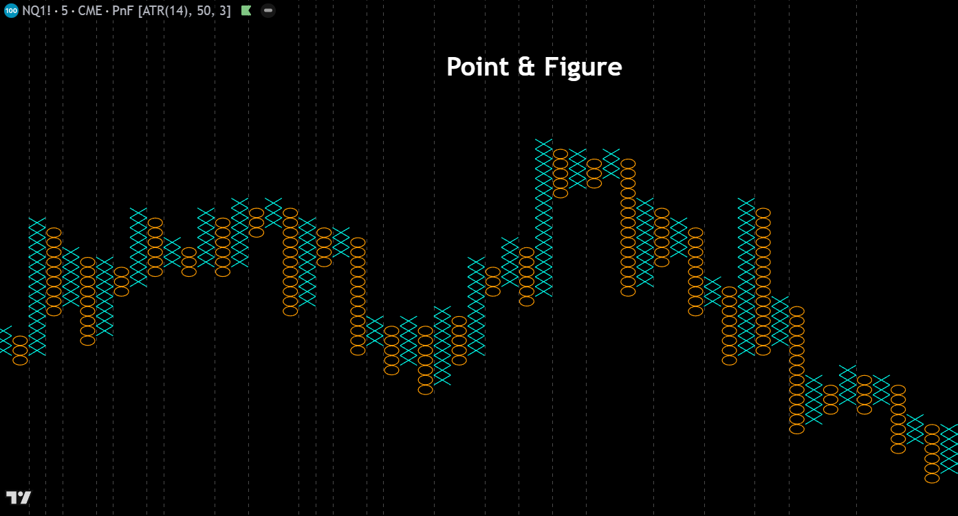
Point & Figure – Point & Figure charts plot columns of X’s (rising prices) and O’s (falling prices) based purely on price movement, with each symbol representing a defined price increment (box size). A new column begins only when price reverses by a set number of boxes (typically three). By eliminating time and focusing solely on price, P&F charts produce clean formations ideal for calculating precise price targets, identifying breakouts, and drawing trendlines. They remain a favorite among classical chartists for their objectivity and the clarity of their buy and sell signals.
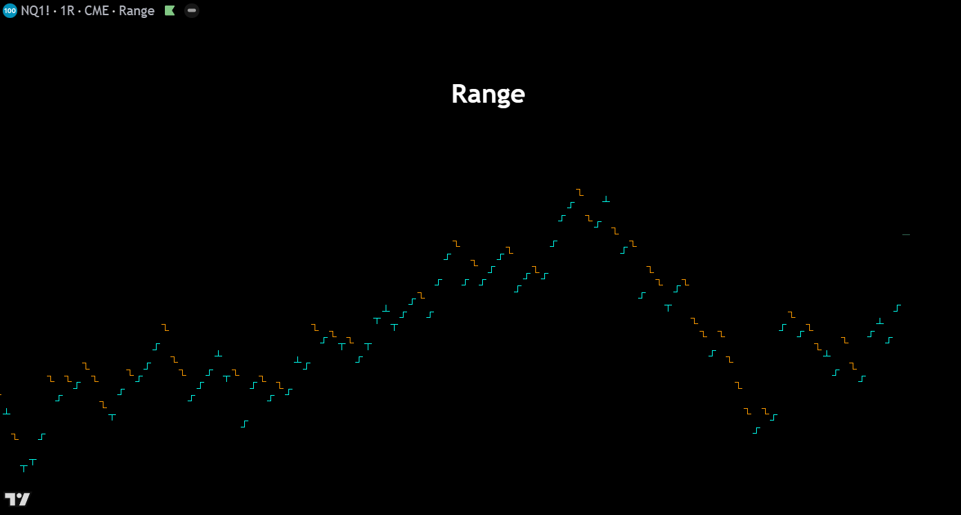
Range – Range charts create a new bar only when price has traversed a user-specified number of ticks or points, regardless of how much time has elapsed. Each bar represents an equal unit of price movement, which normalizes volatility and produces consistent bar sizes across all market conditions. During high-volatility periods bars form rapidly, while quiet markets generate very few bars. Range charts are popular among day traders and scalpers because they eliminate time-based noise and keep the focus on actual price movement and market participation.